Skeuomorphism and Flat Design
Who has heard of Skeuomorphism? I think the word only becomes known now, as it stands in contrast with the new trend towards ‘Flat Design’…. The term Skeuomorphism even is not in the automatic spellchecker, nor is it in my apple dictionary.
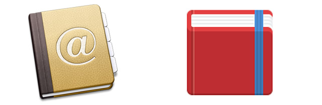
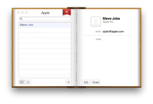
Every web designer understands latest since the hype of the flat design the contrasting views. Looking back in Apples “history”, in 2011 Apple introduced with the new operating system Lion a new look of its address book. That “new” look was in my eyes a completely dusty and old fashioned look: the address book suddenly looked like a real address book from a century back, with a kind of leather look resembling a physical hard cover book. This design approach to resemble familiar real-life objects is called “skeuomorphic”.
When with the Lion operating system this in my eyes tasteless skeuomorphic designs appeared I was in disbelieve that Apple went that far “back in time” as to choose an antiquarian look and feel for it’s address book – even in real World I never would purchase an address book with this look…. And maybe that is one of the problems of the skeuomorphic design approach, that by resembling a real-life object it faces a time stamp and may clash heavily with different cultural and geographical perspectives. Imagine how an address book looks in India, versus in China, versus in Italy, versus in … um Silicon Valley?!
In that respect I am very pleased to see a trend away from skeuomorphism, nobody could pronounce that word anyway, to a more abstract and simple and clean design, and I can’t wait to see Apples new address book, assuming that with a next operating system Apple might go in the direction of the iOS, with a minimalistic and calm design approach.